Documentation Index
Fetch the complete documentation index at: https://fillout.com/help/llms.txt
Use this file to discover all available pages before exploring further.
List of button types
By default, your form will have the following buttons:- Next - assigned button for form, review, payment, login, and scheduling pages
- Submit - button to proceed to the ending page
- Back - located on the upper left corner, allows respondents to view previous pages
- Start - found in cover pages
- Skip - lets respondents proceed to the next page without answering the current one
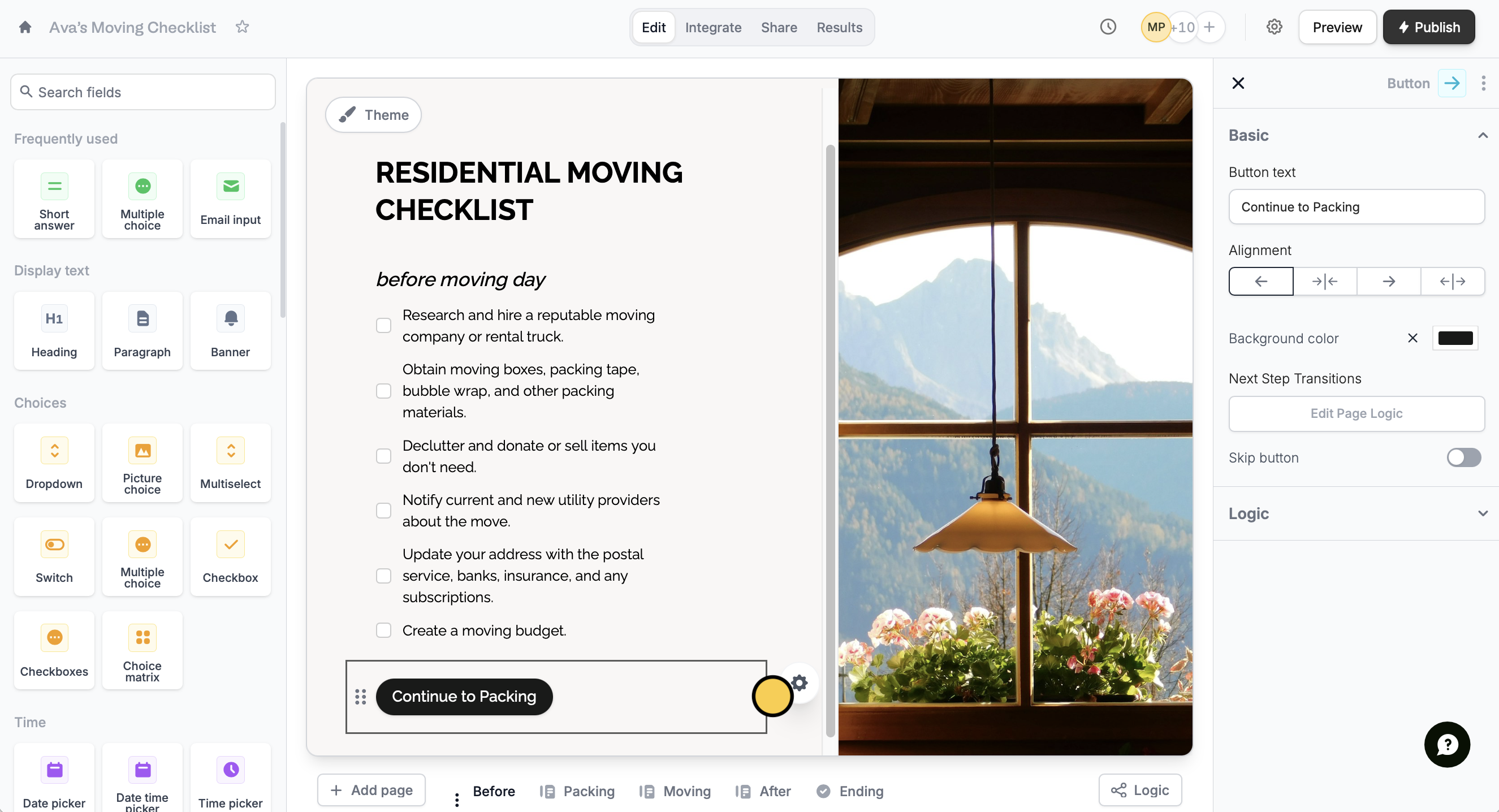
Customize button
Click a button’s . On the right-hand panel, you can:- Edit the default button text to your preferred label
- Change its alignment
- Change its background color
Theme on the upper left part of your form followed by Advanced designer. The designer lets you:
- Change the rounding or shape of your button
- Change the subtle animation
- Change the back button’s position

Custom themes are available on the Starter plan and above. Learn more about our pricing plans and advanced features here.
Add a skip button
Go back to your button’s right-hand panel settings. Toggle theSkip button switch.
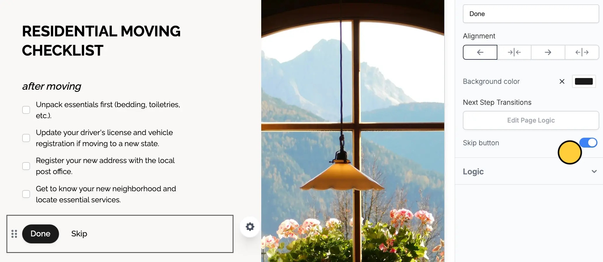
Make sure your Back button position is set to Default (Top Left) to be able to use a Skip button.
Related articles
Themes
Select from hundreds of themes or create your own.
Page logic
Hide or show pages or custom endings based on respondent input.
Auto jump
Auto-redirect to the next page after making a selection.